How to design a certificate that looks professional
A practical guide to certificate design: page setup, information hierarchy, restrained branding, built-in verification, accessibility checks, and a pre-flight export checklist.
Lina Park
Head of Design, CertSeal

You probably have a certificate draft open already, and it looks fine. The logo sits in the corner, the border feels formal, the recipient name is centered. Then someone asks the question that matters: can an employer verify this in seconds, and does it still read clearly as a phone attachment, a printed page, and a LinkedIn thumbnail?
That is where most designs fall apart. Designing a certificate is not only about making a document look polished — it is about making it instantly understandable, verifiable, and usable after it leaves your email system. A certificate that earns trust communicates four things fast: who issued it, what it proves, who earned it, and how to confirm it.
This guide walks through the whole design process in order — canvas, hierarchy, brand, verification, accessibility, and export — with the checks that catch real failures before you issue a batch.
What a certificate has to do in the first three seconds
Nobody studies a certificate. They glance at it in an inbox, a feed, or a stack of applications. Nielsen Norman Group’s research on reading behavior found that users read at most 28% of the words on an average page visit, and 20% is more likely. A certificate gets less attention than that, not more.
So treat the certificate as a verification object from the first draft, not as a decorated page. Five fields carry almost all of the weight:
- Recipient name
- Credential title
- Issuing organization
- Issue date (and expiry, where relevant)
- Verification block — credential ID, QR code, and a human-readable URL
Everything else is support. If the border is doing more work than the credential title, the design is upside down.
The five-layer model
The fastest way to avoid a pretty-but-useless certificate is to work in layers, in this order:
- Page setup — whether the file behaves in print, PDF, and digital delivery.
- Information hierarchy — whether someone can read the credential in seconds.
- Brand identity — whether it feels credible without turning into a flyer.
- Verification — whether an employer can confirm it without emailing you.
- Accessibility — whether it still works in grayscale, at thumbnail size, and on a small screen.
Practical rule: if a certificate needs a long explanation, the design is doing too much and the content is doing too little.
Working in that order stops teams from fixing the wrong problem first. A refined border will not rescue a layout that hides the issuer or buries the verification method. If you are starting from scratch, the CertSeal template library already respects this structure, so you can spend your time on content instead of rebuilding the frame.
Set page size, orientation, and grid before anything else
Start with the canvas, not the decoration. If you change page size or orientation after the text boxes, seals, and signature lines are placed, everything shifts and the template becomes a round of manual repairs.

Two standards cover almost every program. ISO 216 defines A4 as 210 × 297 mm, and US Letter is 8.5 × 11 in. Translate those into working pixel dimensions before you design:
| Paper | Landscape at 96 ppi (screen) | Landscape at 300 ppi (print) |
|---|---|---|
| A4 | 1123 × 794 px | 3508 × 2480 px |
| US Letter | 1056 × 816 px | 3300 × 2550 px |
Design at print resolution if the certificate will ever be framed; export a screen-sized copy for email and sharing. If you are unsure which paper standard to use, pick the one your recipients print on — A4 outside the US and Canada, Letter inside.
Landscape is the safer default. Recipient names and credential titles need width more often than height, and a wide canvas keeps the verification block from crowding the issuer header. Lock the orientation first, then set generous margins and a simple grid. Two columns is enough for most layouts; three helps when the logo area, the content area, and the verification area need to stay visually separated.
Then run the cheapest test in certificate design: drop in the shortest realistic name, then the longest one you can find in your recipient list. If the signature line, date, and credential ID still sit cleanly inside the same frame, the grid is sound. If a long name pushes into the seal, fix it now — not after 400 certificates have gone out.
Build an information hierarchy people can read in seconds
A strong certificate does not treat every field as equally important. The eye needs one clear path, and it should land on the recipient name and the credential title first. Everything else — issuer, date, credential ID, criteria — informs the claim from below without competing with it.

What deserves the largest type
A layout that works looks roughly like this, top to bottom:
- Issuer header — organization name or logo, modest and consistent.
- Credential type line — “Certificate of Completion,” “Certificate of Achievement,” and so on.
- Recipient name — the largest type on the page.
- Credential title — nearly as prominent as the name; be specific.
- Support line — issue date, expiry, signatory name and title.
- Verification block — credential ID, QR code, and verification URL.
That order matches how people actually read the document: identity first, then the achievement, then the proof it can be checked. Use two type sizes of separation between the name and the support line, not two points. If the name, the date, and the ID all look about the same size, the hierarchy has collapsed and the certificate reads as a wall of text.
Be specific in the title, too. “Advanced Fire Warden Training — Level 2” is worth more on a résumé than “Training Certificate,” and it makes the credential easier to interpret years later. Our guides to completion certificates and achievement certificates cover the wording differences in more detail.
What to leave out
Course outlines, module lists, program length in prose, and full administrative disclaimers usually belong on the hosted verification page — not on the certificate face. A busy certificate gets noticeably better the moment you delete two sentences and let the credential title do its job.
More text feels thorough to the issuer. It reads as clutter to everyone else. The certificate should prove something, not narrate the program history.
Apply brand identity without overpowering the credential
More certificates are ruined by over-branding than by weak typography. Teams want the document to feel unmistakably theirs, so they add a full-bleed background, three fonts, an oversized logo, and a large seal — and then wonder why the recipient name looks secondary.
Use the brand to frame the credential, not to compete with it. Four rules hold up in practice:
- One accent color. Reserve it for the credential type line, a thin rule, or the seal outline. Everything else can be ink and paper.
- Two typefaces maximum. One family for display, one for supporting text. A single family with two weights is often better.
- A modest logo. The issuer should be clearly identifiable and never louder than the award.
- Restrained signatures. One or two signature lines confirm authority. Four make the page look like a permit.
A certificate should look like it came from a serious organization — not like a poster that happens to mention an achievement.
The fastest way to wreck a clean layout is a script font in the recipient name field. It looks elegant at 400% zoom in the editor and turns to mush in a thumbnail, a low-resolution screenshot, or a fax-quality scan. If your brand system depends on ornate detail, push it to the border or the verification page and keep the certificate face calm.
Consistency across programs matters as much as any single design. If your safety training, leadership program, and event certificates all use the same header treatment, accent color, and verification block, the whole credential set reads as one organization. Customizing a shared base in the certificate maker is far easier than reconciling six one-off files later.
Design verification into the layout from the start
A QR code, a credential ID, and a verification URL are not add-ons you place in the leftover space. They are the elements that decide whether the certificate can be trusted without an email to your team.
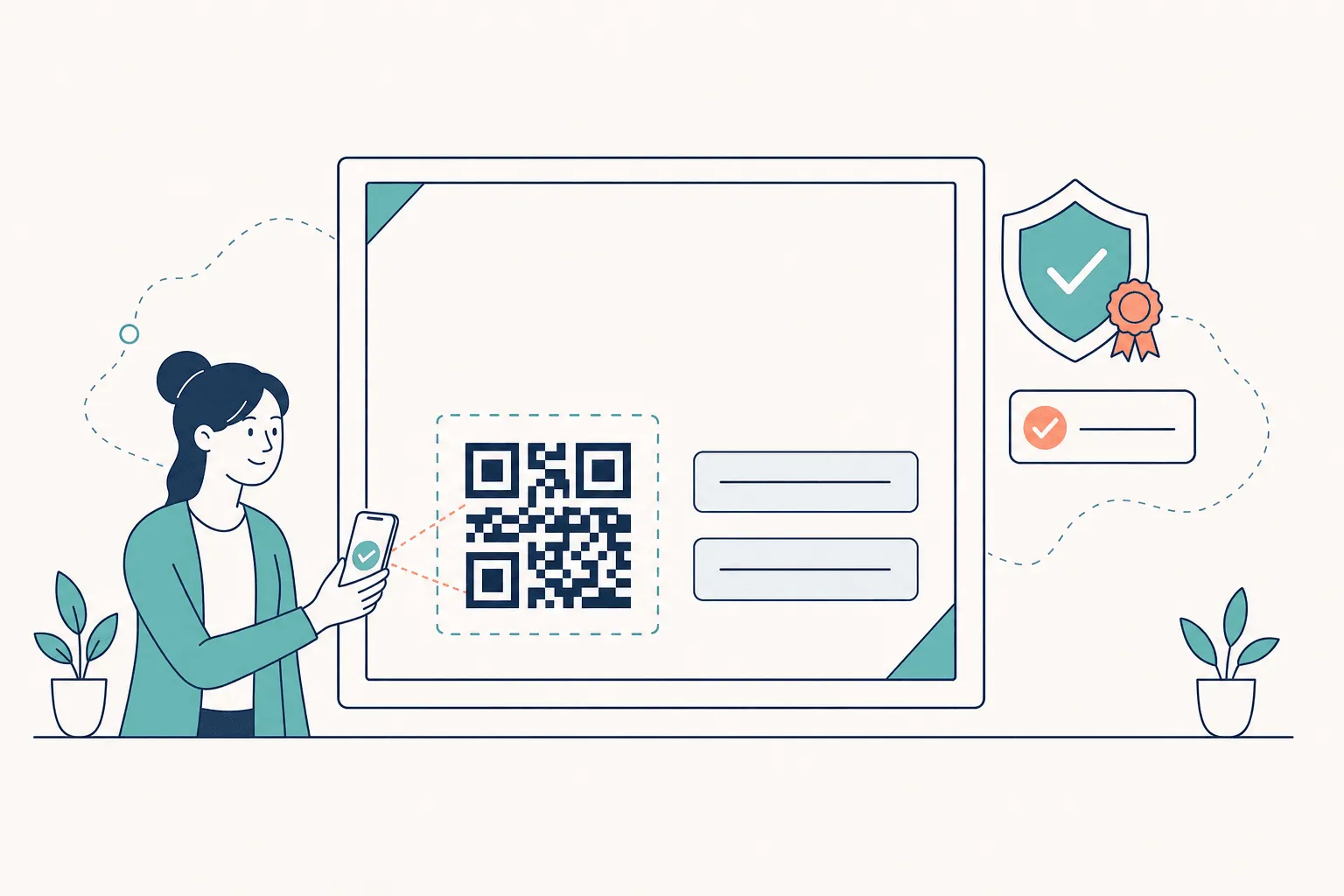
Where the verification block sits
Put the QR code low on the page or in a corner, with real whitespace around it. That margin is not an aesthetic choice: the QR Code specification, ISO/IEC 18004, requires a quiet zone of four modules on every side for reliable decoding. Crowd it with a border or crop it at the page edge and scanners start to fail — usually on the printed copies you never tested.
Keep the credential ID and the verification URL next to the code so a human can read one while a scanner handles the other. Not everyone scans. Some employers type the URL, some search the ID, and some are looking at a photocopy where the QR is the only route. A design that assumes one verification path will frustrate someone in real use.
What the layout has to support
The certificate is a pointer, not the record. The URL it points to should stay live, show the issuer, recipient, credential, issue date, and current status, and reflect revocation if the credential is withdrawn. That is the difference between a document someone could recreate in a word processor and a credential someone can check.
Design for that from the start: leave a stable block for the ID and URL, size the QR so it still scans at print size, and never make the verification state depend on a visual cue that disappears in grayscale. How to issue digital certificates covers the delivery and verification workflow end to end, and the certificate template docs explain how dynamic fields map onto the block you just designed.
Accessibility and localization checks that catch real failures
A certificate can look perfect on a designer’s monitor and fail the moment it is opened on a phone, printed in black and white, or viewed by someone with a color vision deficiency. Accessibility is a design input, not a QA cleanup step — and it is not a niche concern. Mobile devices account for more than half of global page views, and colour vision deficiency affects about 1 in 12 men and 1 in 200 women.
Two WCAG criteria carry most of the value here:
- Contrast. WCAG 2.2 Success Criterion 1.4.3 sets a minimum contrast ratio of 4.5:1 for normal text and 3:1 for large text (18 pt, or 14 pt bold). Gold text on a cream background almost never passes. Check the recipient name, the credential title, and the verification URL specifically.
- Don’t rely on color alone. Success Criterion 1.4.1 means a green border cannot be the only signal that a credential is valid. Pair any status cue with a word, an icon, or a shape.
Run these five checks before you approve a design:
- Convert to grayscale. If the recipient name fades into the background or the seal disappears, the contrast or the type weight is too light.
- Shrink to thumbnail. View the certificate at about 200 px wide — the size it appears at in a feed or an email preview. Name and title should still be readable.
- Test long and translated names. Different scripts need more line height and wider boxes. If your program is international, the name must stay dominant even when the header shrinks to make room.
- Print one copy. Check margins, seal placement, and whether the QR still scans from paper.
- Zoom to 100%, not 250%. If the layout only works zoomed in, the hierarchy needs more separation.
If the certificate cannot survive grayscale, it is not finished.
The goal is not a sterile document. It is a certificate that still feels branded and still reads as prestigious when the viewing conditions are ordinary.
Export, bulk readiness, and a pre-flight checklist
Export choices should match how the certificate will actually be used.
| Format | Best for | Verification support | Notes |
|---|---|---|---|
| Print, formal sharing, archival records | Good, when it carries a QR, ID, and URL | Embed fonts; export at 300 ppi if it will be framed | |
| PNG | Social sharing, email previews, LMS thumbnails | Limited unless paired with a live page | Fine for display, poor as a system of record |
| Verifiable URL | Employer checks, live status, revocation | Strongest — pair with the QR and ID | The version that stays accurate after issuance |
Most programs need all three: a hosted credential as the source of truth, a PDF for the recipient’s records, and a PNG for sharing. If certificates go out in cohorts, the bulk generator maps one design to a spreadsheet of recipients so the layout you tested is the layout everyone receives, and CertSeal integrations can trigger issuance from your LMS or workflow tool when a course is completed.
Bulk issuance is mostly a stress test of your template. Long names, missing optional fields, duplicate records, and accented characters are what expose weak spacing and bad data mapping. Before you send a batch:
- Confirm every dynamic field — name, credential title, issuer, date, and ID all map to the right column.
- Export one long name and one short name and compare alignment.
- Check grayscale and thumbnail views one last time.
- Scan the QR from the exported file, not from the editor preview.
- Read the final PDF once, slowly. One typo caught here is cheaper than 400 reissues.
When those checks are routine, certificate design becomes repeatable instead of fragile.
Frequently asked questions
What size should a certificate be?
Use A4 (210 × 297 mm) or US Letter (8.5 × 11 in), matched to where your recipients print. In pixels, that is 1123 × 794 (A4) or 1056 × 816 (Letter) in landscape at screen resolution, and 3508 × 2480 or 3300 × 2550 at 300 ppi for print.
Should a certificate be landscape or portrait?
Landscape suits most credentials because names and titles need horizontal room, and it leaves space for a verification block without crowding the header. Portrait works well for formal academic or association documents with a lot of body copy. Pick one before you design — switching later breaks the layout.
What fonts work best on a certificate?
A readable serif or a clean sans-serif for the recipient name and credential title, and one supporting family for metadata. Avoid script fonts in the name field: they lose legibility in thumbnails, grayscale, and low-resolution scans. Two typefaces is the practical ceiling.
How do I add a QR code to a certificate?
Generate the code from the credential’s unique verification URL — not from your homepage — and leave a quiet zone of at least four modules around it. Place it in a corner with whitespace, keep the credential ID and readable URL beside it, and test the scan from an exported PDF and a printed copy. Certificates issued through CertSeal include a verification URL and QR by default.
How many colors should a certificate use?
One accent color plus ink and paper. Use the accent on the credential type line, a thin rule, or the seal outline, and check every text-on-background pair against the 4.5:1 contrast minimum before approving the design.
Do I still need a seal and a signature?
They are credibility markers, not requirements. One signature from a real, named signatory with their title does more for trust than three decorative lines. A live verification page does more than either — see digital badges vs certificates for how the formats compare.
Design your certificate
Good certificate design is mostly ordering decisions correctly: set the canvas, build the hierarchy, apply brand with restraint, design the verification block in from the start, then test in grayscale and at thumbnail size before you export. Do that once and the template keeps paying off for every cohort after it.
Start from a design that already has the structure in place — browse the certificate template library, customize it in the certificate maker, or try the free certificate generator if you just need one for tomorrow.
Start free with CertSeal and issue your first verifiable certificate today.
Related reading
- How to issue digital certificates in 2026 — delivery, verification, and analytics after the design is done
- 12 free training certificate templates — designs to start from, by audience
- How to create a certificate of completion — required fields and copy-ready wording
- How to launch a certification program — the program design behind the credential
Keep reading
Certificates
Completion of course certificates: a practical issuer guide
What a completion of course certificate actually claims, the five fields it needs, static PDF vs verifiable credential, and how to run an issuance process you can still defend two years later.
Certificates
What is a certificate? Types, uses, and how verification works
A certificate is issuer-signed proof of a defined achievement. Here's what it actually claims, how completion, achievement, and competency differ, and why verification decides whether it counts.