How to make a badge that recipients actually trust
A practical guide to making a digital badge: a face that reads at thumbnail size, the metadata that makes it verifiable, output formats by channel, bulk issuance, and a launch-day checklist.
Riya Sharma
Co-founder & CEO, CertSeal

Most guides on how to make a badge start in the wrong place. They treat the badge as a graphic asset: pick a shape, drop in a logo, export a PNG. Twenty minutes later you have something that looks finished and proves nothing.
That gap matters more than it used to. In Coursera’s 2025 micro-credentials report — a survey of more than 1,000 employers across ten countries — 96% said a micro-credential strengthens a candidate’s application and 85% said they were more likely to hire someone who holds one. But employers also check. HireRight’s 2025 Global Benchmark Report found that more than three-quarters of businesses uncovered at least one candidate discrepancy during screening in the previous 12 months, with education and employment claims among the most common types. A badge that can’t be checked lands in exactly the pile they’re screening for.
None of this is new, only faster. Cylinder seals in Mesopotamia served as a mark of ownership or identification more than four thousand years before Whitehead & Hoag patented the celluloid pin-back button in 1896 and turned wearable status into a mass-produced object. The form keeps changing. The function hasn’t: people want a visible signal that survives scrutiny.
So the thing you are building is not the image file. It’s the proof layer underneath it — the metadata, the verification path, and the revocation logic that let a stranger check the claim without emailing your team. This guide covers the whole build in order: the badge face, the metadata, the output format, delivery at scale, and the checks to run before the first send.
Why most badges fail before they are issued
A badge can fail before the recipient ever sees it. Not because it’s ugly — because it can’t be checked, can’t be shared confidently, and doesn’t point anywhere. Most “make a badge” tutorials stop at the export dialog, which is roughly halfway through the job.
The image is not the credential
A design-only workflow creates a dead end. A PNG on a profile looks fine until someone asks what it proves, who issued it, and whether it still counts. The problem isn’t the artwork. It’s that the artwork can’t answer those questions by itself.
The failure is most visible in exactly the place badges are supposed to win: social and professional feeds. A recipient reposts the graphic, and without a live verification path every repost is just another copy of a picture. If you want the badge to carry weight with a recruiter, it has to resolve to an issuer-controlled record that stays current.
Verification gets skipped because it’s harder to demo than a template gallery. That’s a product decision, not a technical constraint — and digital badges vs digital certificates is where the difference shows up in practice.
Practical rule: if a badge can be separated from its proof and still look complete, it isn’t a credential yet.
Trust is what gets shared
Recipients don’t share what looks good. They share what feels safe to claim. If the badge looks unofficial, or the issuer can’t be confirmed in one click, people hesitate — and hesitation kills adoption long before anyone complains about the icon.
I’ve watched programs spend three weeks on border treatments and zero days on what a reviewer sees. A reviewer wants four things: who issued this, what it took to earn, when it was issued, and where to check it. When those are missing, the badge is decoration, and decoration doesn’t move a hiring decision.
The useful test is one sentence long. Can someone outside your organization verify this claim without contacting you? If not, the proof layer is still missing, no matter how good the badge looks.
Design a badge face that survives a 64-pixel thumbnail
Design still matters — as a signal, not as the product. A badge lives at small sizes: a profile grid, an email signature, a feed thumbnail, a verification preview on a phone. Design for that first and it will look fine large. Design for the 400% editor zoom and it will turn to mush everywhere else.

Hierarchy first, ornament last
A badge holds far less information than a certificate, so ranking matters more. Work in this order:
- Silhouette — a bold geometric shape (circle, hex, shield) that stays recognizable at 64 px.
- One central mark — an icon or a short word. Never a detailed illustration and a long title together.
- Credential title — the most readable text on the face, and specific: “Cloud Security Fundamentals,” not “Certified.”
- Issuer — clearly identifiable, never louder than the achievement.
- Version or year — subtle, so the badge can age without looking obsolete.
Two or three colors is the ceiling, drawn from your brand. Warmer, higher-energy palettes suit bootcamps and internal recognition; restrained color, tighter alignment, and more formal spacing suit professional bodies, because that audience reads restraint as seriousness.
Typography is where badges most often break. Decorative and script faces lose their shape in a thumbnail, a screenshot, or a grayscale print. If a word has to be legible at profile-grid size, it needs weight and space, not flourish. The same discipline that carries a certificate face applies here — how to design a certificate covers the contrast and grayscale checks in more detail, and they all transfer.
Design rule: authority comes from restraint. Overbuilt seals, heavy gradients, and crowded badge faces make a credential look less credible, not more.
Build fields that scale across cohorts
Dynamic fields are what turn a badge design into a badge program. Recipient name, issue date, cohort label, and achievement variant should populate from your issuance data, not get hand-edited per file. That kills a whole category of typos and keeps 400 badges consistent with each other.
It also changes the layout. Leave real room for long names and non-Latin scripts — if you space the design around the shortest name on your test list, the first real recipient with a long one will break it. Set up the mapping once in the certificate maker or start from a design in the template library, then test with the longest name you can find before you commit.
Embed the metadata that makes a badge verifiable
This is the part the tutorials skip and the part employers use. A badge becomes verifiable when it carries structured metadata: who issued it, who earned it, what it represents, when it took effect, and where the proof lives.
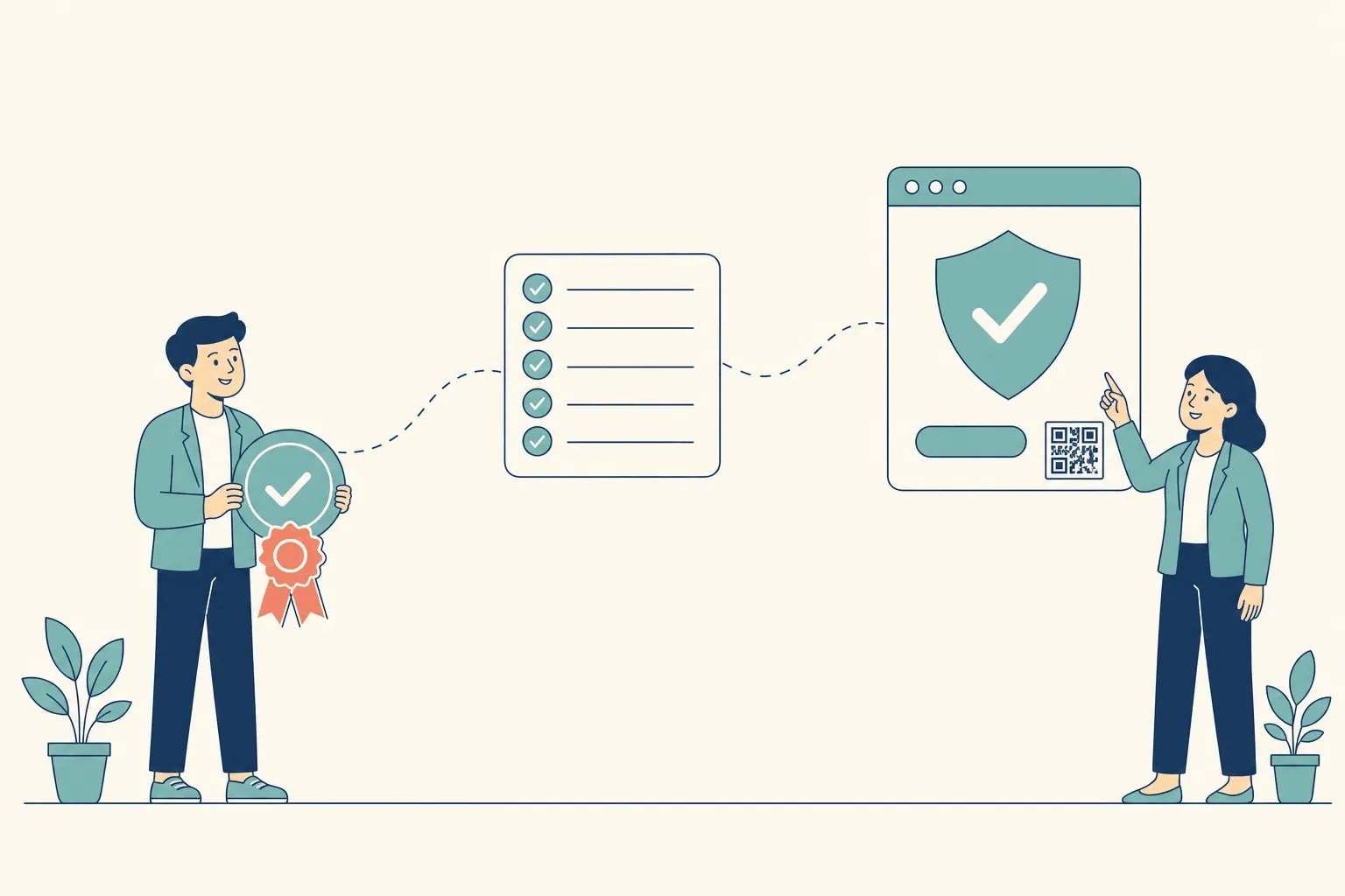
The fields a reviewer actually needs
Each field exists to answer one question. If a field is missing, the question becomes a support ticket.
| Field | The question it answers | Why it matters |
|---|---|---|
| Issuer identity | Who stands behind this? | Anonymous claims carry no weight |
| Recipient | Whose credential is this? | Ties the record to one person |
| Achievement name | What is being claimed? | Specificity is what makes it useful years later |
| Criteria | What did it take to earn? | The difference between a skill claim and a participation trophy |
| Issue date (and expiry) | Is it current? | Anchors the claim in time |
| Credential ID + verification URL | Where do I check? | The only field that makes the rest checkable |
That list isn’t a house convention. 1EdTech’s Open Badges standard is built on the same idea: badges carry metadata about the achievement, the issuer, and the earner, and each badge is digitally signed by the issuing organization. In Open Badges 3.0, an achievement must carry a name, a description, and criteria; the credential carries the issuer profile, the earner as its subject, a validity date, and a cryptographic proof.
That signature is the difference between a credential and a copyable image. It aligns badges with the W3C’s Verifiable Credentials Data Model 2.0, which became a W3C Recommendation on 15 May 2025 — so a badge can be checked for tampering by anyone, using published rules, without going through your platform.
The practical payoff is portability. A badge with complete metadata travels: into a profile, a portfolio, a wallet, a learning record store — and still means the same thing when it lands. A badge with thin metadata means whatever the viewer assumes.
What the verification page has to do
A verification page is evidence space, not marketing space. Above the fold it should show the achievement, the recipient, the issuer, the issue date, and the current status in plain words. If a reviewer has to hunt for the basics, the page is failing.
Three requirements decide whether it works in the real world:
- No login. The page has to open from a feed, an email, or an internal HR system without an account. A gate turns a five-second check into a decision not to bother.
- One record, two routes. Keep the credential ID readable next to the QR code or link. Some people scan, some type, some are looking at a photocopy.
- Mobile-first. Most of that traffic arrives on a phone — mobile accounts for more than half of global page views.
If the badge will ever be printed on a certificate, a pin, or an event handout, the QR code needs breathing room. The QR specification, ISO/IEC 18004, requires a quiet zone of four modules on every side to decode reliably. Crop it to fit and scanners fail — usually on the printed copies nobody tested.
A verification page is not a landing page. It’s the moment your badge either holds up or doesn’t.
Revocation belongs in the design, not the incident response
Circumstances change. People fail a re-certification, a cohort record turns out to be wrong, a credential expires. If your only revocation mechanism is deleting an image, old claims circulate forever.
Design for status from the start: the badge points at a record, the record carries a status, and the verification page shows that status honestly. The verifiable-credentials ecosystem treats this as core infrastructure — the W3C’s Bitstring Status List exists so a verifier can check whether a credential has been revoked or suspended. Decide who can revoke, what the page says afterwards, and whether the recipient gets notified — before launch, not during your first exception.
Choose the output format per channel
Different channels need different artifacts, and the common mistake is forcing one format to do every job. You can support all of them; just don’t confuse them with each other.
| Output | Best for | Verification | Trade-off |
|---|---|---|---|
| Verifiable URL | Recruiter checks, live status, revocation | Strongest — live record | Needs a hosted page that stays up |
| PNG image | Profiles, email signatures, slides, feeds | None on its own | Copyable; only trustworthy when paired with a live record |
| Print, formal attachments, filed records | Good, if it carries an ID, QR, and URL | Static from the moment it’s exported | |
| Open Badge JSON | Wallets, LRS, machine-readable portability | Cryptographic, standards-aligned | Invisible to humans; not a share asset |
For most programs the answer isn’t one format. It’s a verifiable URL as the source of truth, plus a recipient-friendly PNG and — where the audience expects paper — a PDF, all generated from the same record.
Think in channels, not file types
Teams usually open the conversation with “should it be a PNG or a PDF.” Wrong first question. Ask where the recipient will actually use it: profile share, email attachment, printed handout, internal compliance record, or all four.
Then generate every output from one master credential record. Split the workflow earlier than that and you’ll be maintaining mismatched versions of the same claim, which is precisely how credibility erodes. CertSeal issues verifiable URLs, PDFs, and PNGs from a single badge record for this reason — the value isn’t the file menu, it’s that issuance, verification, and reuse never drift apart.
Issue at scale without losing the personal touch
One badge is easy. Four hundred badges without duplicates, broken fields, or an awkward delivery email is where programs actually fail. Automate the repetition; keep the recipient experience specific.

Start with one clean data source
CSV upload, spreadsheet sync, or API — they all depend on the same discipline. Field names match the template, values are consistent, duplicates are caught before send, and dates use one format. Messy input produces messy badges at scale, and you only find out after delivery.
Test the mapping with five rows before you run four hundred: one long name, one accented name, one missing optional field, one duplicate, one edge-case achievement variant. The bulk generator maps a spreadsheet onto a single tested design, and the batches documentation covers field mapping and error handling in detail. If issuance should fire from a course completion instead of a manual upload, CertSeal integrations connect it to your LMS, Zapier, or the REST API.
Deliver like the institution that awarded it
Recipients open a badge email differently when it looks like it came from the organization that awarded the badge. A generic sender or an unstyled template makes a legitimate credential feel uncertain, which is a strange way to undo work you already did correctly. Brand the delivery — email templates exist for exactly this.
Timing does real work too. Issue badges as the achievement is earned, not in a quarterly batch. A badge that arrives while the work is still fresh gets opened, read, and shared. A badge that arrives eleven weeks later reads as administrative cleanup.
Track, dedupe, retry
Open rates and issuance status are operational instruments, not vanity metrics. They tell you whether the send landed and whether the workflow finished. If a batch stalls or a field mapping breaks, you want to know before recipients start asking why they got nothing.
Duplicate sends confuse people and cost you trust; failed sends turn into support tickets. A good workflow logs the error clearly enough that you fix the source data rather than reconstructing what happened from inbox replies. Wire status changes into your own systems with webhooks if issuance needs to be reflected elsewhere.
Operational rule: the recipient should feel singled out, even when the badge was issued in a batch of four hundred.
Launch-day checklist
A badge program launches well when design, metadata, format, and delivery all agree with each other. Most launch problems are coordination problems, not craft problems.
Before the first send
- Look at it small. View the badge at 64 px and 200 px. If the title or icon dissolves, fix the face before anything else.
- Convert to grayscale. If the badge relies on color to read as valid, it fails in print and for the ~1 in 12 men with a color vision deficiency.
- Confirm every metadata field. Issuer, recipient, achievement name, criteria, issue date, credential ID, verification URL. All present, all mapped to the right column.
- Send yourself a real one. Open it on a phone, click the verification link, and read the page as a stranger would.
- Scan the QR from the exported file, not from the editor preview — and from paper if you’ll ever print it.
- Revoke a test badge. Confirm the verification page changes, and that you know who is allowed to do this.
- Check the failure path. Know where issuance status appears and how a failed or bounced send is surfaced.
After launch, measure what recipients do
The useful signals are behavioral, not aesthetic. Watch delivery open rates, share rate, and — most importantly — whether the verification page gets real outside traffic. Verification traffic is the only metric that tells you the badge is functioning as a credential rather than sitting in an inbox.
Recipient feedback helps when you ask specific questions: was it obvious what the badge was for, was the proof path clear, did sharing it feel safe? Those answers map directly to trust, which is more actionable than an opinion about the icon.
If recipients hesitate to share, you have a proof problem, not a design problem.
Frequently asked questions
How do I make a badge for free?
Start from a template, set the badge face and dynamic fields, then issue to a verification page. You can do the whole loop at no cost with the free certificate generator and upgrade only when you need bulk delivery or your own branding on the verification page. What you should not do for free is skip the metadata — a template PNG with no issuer, criteria, or verification URL costs nothing and proves nothing.
What size should a digital badge be?
Design square and export at least 400 × 400 px, ideally 600 × 600, in PNG or SVG. Then judge the design at 64 px, because that’s closer to how it appears in a profile grid or feed. If it survives that, it survives everywhere.
What metadata does a digital badge need?
At minimum: issuer identity, recipient, achievement name, criteria, issue date, and a credential ID with a verification URL. Add expiry and a status field if the credential can lapse or be revoked. Anything less and a reviewer has to take your word for it.
Are Open Badges the same as verifiable credentials?
They overlap now. Open Badges 3.0 expresses a badge as a W3C Verifiable Credential, so the badge is a cryptographically signed data object that anyone can check against a published standard. In practice: “Open Badge” describes the credential type, “verifiable credential” describes the trust plumbing underneath it.
Can a digital badge be revoked?
Yes, if you built it on a live record. Revocation updates the status on the credential, and the verification page reflects it immediately — the image in someone’s old post no longer resolves to a valid claim. This is the main reason a hosted URL beats a static file as a system of record.
Should I make a badge or a certificate?
Badges suit granular, stackable, skill-level achievements. Certificates suit formal, comprehensive, one-per-program completions. Mature programs usually issue both — a program certificate plus module badges. Digital badges vs digital certificates walks through the decision, and how to issue digital certificates covers the certificate side end to end.
Do physical badges still make sense?
For in-person programs, yes — pins, lanyard badges, and printed handouts still do real work. Print a QR code that resolves to the digital credential and the physical object inherits the proof layer instead of competing with it.
Make a badge that holds up
Making a badge is mostly ordering the work correctly: design a face that reads small, embed the metadata a reviewer needs, choose an output per channel, deliver it branded and on time, then test the verification path before the first send. Do that once and the design keeps paying off for every cohort after it.
Start from a structure that already has the proof layer in place — browse the template library, customize it in the certificate maker, and issue in cohorts with the bulk generator.
Start free with CertSeal and issue your first verifiable badge today.
Related reading
- Digital badges vs digital certificates — which format to issue, and when to issue both
- How to design a certificate that looks professional — hierarchy, contrast, and verification blocks in more depth
- How to issue digital certificates in 2026 — delivery, verification, and analytics after the design is done
- How to launch a certification program in 2026 — the program design behind the credential
Keep reading
Certificates
Completion of course certificates: a practical issuer guide
What a completion of course certificate actually claims, the five fields it needs, static PDF vs verifiable credential, and how to run an issuance process you can still defend two years later.
Certificates
What is a certificate? Types, uses, and how verification works
A certificate is issuer-signed proof of a defined achievement. Here's what it actually claims, how completion, achievement, and competency differ, and why verification decides whether it counts.